
Saturday, December 5, 2009
Thursday, November 12, 2009
Concept Statement
The whole, its parts.
Photography allows me to express myself and interpret the world I live in. No other process allows me to translate what I envisage into a visual piece so freely and comfortably.
In this piece my original aim was to find a way to represent the quote ‘the whole is greater than the sum of its parts' (Aristotle), using the body as an illustration. As I began researching how others had interpreted the quote, I developed my own understanding. When thinking about the body and the concept as a whole I realized that this quote outlines my perception of the world. I am very in touch with my surroundings and am continually dissecting and analyzing segments of it.
I have been inspired by the work of Shane Rozario and Howard Schatz. Rozario documents and represents the portrait as a whole, as well as single parts. Schatz uses minimal light to emphasize the body’s contours and aesthetic nature. Both artists photograph the same subject but in a distinctive way.
I chose to present my images in a less ‘constructed’ way to emphasize the unique and organic structure of the body. The title ‘The whole, its parts’ is included next to the work without an explanation so that this concept can stimulate the viewer’s thoughts without shaping their perception.
I have formed a new appreciation of the distinctive elements that make up the body as a whole; their form, texture, structure. By dissecting the body into different parts I have realized that although the body as a whole may be greater than its parts in size, its parts are no less ‘greater’ in terms of value.
Christina Nikolovski

Monday, October 19, 2009
Shoot 3
Now I'm not sure whether to do square format or full frame. In this shoot I focused on negative lighting, graduation of tones, as well as formations of the body. Also - the isolation of body parts and their abstract nature when they are not viewed with the rest of the body.


Friday, September 18, 2009
Shoot 2
Today I experimented with negative lighting, similar to the examples in the previous post (although I haven't posted these pics yet - shoot is on Tuesday).
These images are an experimentation of form, but this time with more detail than just the outline of the body. I have isolated a certain part of the body and am experimenting with displaying it so that it can almost pass as other parts. Can you guess what it is? Which is the right way up? And as an abstracted image, which do people think works the best?
More images after Tuesday
Not sure which one to choose, feedback would be appreciated:)


Tuesday, September 8, 2009
Shoot 3: Plan
My plan for my next shoot is to try some lighting techniques I have never actually used. Here is what I am thinking:
- Black background
- One light source, probably strip light flagged off with a card, to out line the side of my model's body
- Experiment with form again and see what effect negative lighting has on the model and how this varies to shoot 1, where I placed the light directly behind the model. What I am expecting is that although subtle, there will be more detail in these shots.
This is the lighting effect I am aiming for, although I have completely different ideas in terms of body parts and composition. Lets see how I go.

Week 5: Shane Rozario: The Film Mosaic Project
''The Film Mosaic Project mimics the way I observe everything everyday, seeing segments of the big picture to understand the whole."

Shane Rozario
Rozario is a finalist of the 2009 ACMP Projections competition. In his series The Film Mosaic he documents musicians. He uses photography as a medium to visually communicate the way he sees the world, 'in segments of the big picture to understand the whole.' (Rozario 2009)
What is interesting and in my opinion effective, is displaying his work in 'segments' and then as a 'whole' beneath it, so that the viewer can draw a connection between the two alternatives. I don't think I will display the 'whole' in my work, because I want the segments to become a 'whole' when they are viewed together, and I think I am aiming for a more ambiguous approach. However I do love Rozario's work, I love that it's on film and I think what makes his work stronger is that he related this quote (whether he knew it was a quote or not) to himself and his own perception in terms of the way he sees the world. I feel a connection with his work based on personal similarities in terms of perceiving.
Click on the link below to see the flash clip of his work, along with the other 5 finalists - I love the way they have made a multimedia presentation for each photographer and that you can hear them talk about themselves and their work before hand. Really grounds the work and makes you want to go and see the exhibition!

Sunday, August 23, 2009
Shoot 1: Experimenting with Light & Form
Image 1:
Experimenting with what happens when something is flipped - does it become abstract? Can viewers still tell what it is?


 This is the first image - right way up.

Thursday, August 20, 2009
Week 1: Proposal
Informal Proposition
Topic:
‘The whole is greater than the sum of its parts’ Aristotle
I want to investigate this quote by reading how other people interpret this, and finding images which inspire me in terms of how I wish to approach this. My aim is to produce aseries of images in which I isolate parts of the body. Eventually I want to display them next to each other as a whole. At the moment I am thinking to shoot in square format, and presenting my images as black and white. Not sure yet whether I will photograph the same person (whole = person), or different people (whole = humanity). Also not sure what to name the series or whether to provide the description, (ie just the quote, nothing else) or whether to let the viewer interpret the image however they see it.
Photographic Work:
1. Mona Kahn (http://www.monakuhn.com/)

3. Waclaw Wantuch (http://www.waclawwantuch.com)
Saturday, June 27, 2009


Friday, June 5, 2009
Monday, May 18, 2009
Love this Photograph

Photographer: Micah Albert
Keredi, South Kivu. Displaced camp turned into the regions largest slum
Saturday, April 11, 2009
Week 9: Judging of National Portrait Prize 2009
Link to Sunday Arts Program:
http://www.abc.net.au/iview/#/view/344798
Photographers Featured:
1. Peter Brew-Bevin

2. Sahlan Hayes

3. Nikki Toole

Wednesday, April 8, 2009
Week 9:National Photographic Portrait Prize 2009
Favourite Images
These are my two favourite portraits, for the reasons listed below.

Technically the lighting and clarity of this print were amazing. The size and presentation complimented the work. The subjects expressions seem to convey a truthfulness about their character, the photograph is simple yet fantastic.

The first aspect that drew me to this photograph was that it was different. The amazing natural light, reflections and use of a strong red against a faint blue background is striking. The size of the print worked well with the theme, however the clarity was not fantastic. The blurb was just enough to give me a bit of insight to the meaning behind the image. The intention of replacing the traditional middle class white sitter in old Master and Victorian paintings with an indigenous woman is clever and is conveyed effectively in the photograph.
Link to Exhibition: http://www.portrait.gov.au/site/NPPP2009_9.php
 Fearless Leader - Rosiland Smallwood
The exhibition as a whole displays some outstanding pieces. In my opinion, a portrait as distinct from a photograph of a person should encompass an ability to portray an idea, or one or more aspects of a person’s identity, charisma or individuality. To me the strongest portraits are those which can do these things in a creative way, and are even more successful if they allow the viewer the ability to connect with the subject on a deeper level. The above portrait, ‘Fearless Leader’ by Rosiland Smallwood, to me is but a mere photograph. It encompasses none of the characteristics that I believe make a good image. The photograph looks as if it was a snapshot, and that the composition and expression were not thought out at all. The harsh lighting, centred composition, cropping, dull colours, blown out shirt, harsh shadows dividing the subjects shirt and also casting ‘crosshatching’ on the man’s face are all the factors that I dislike about the image. It also makes me wonder how this entry was chosen out of so many photographs, and what justifies it being hung next to some amazing prints.
Week 9: Henri Cartier Bresson on Manufactured Photography
“Manufactured” or staged photography does not concern me . And if I make a judgement it can only be on a psychological or sociological level. There are those who take photographs arranged beforehand and those who go out and discover the image and seize it.
Henri Cartier Bresson
Photojournalism as a Responsibility
“As photojournalists we supply information to a world that is overwhelmed with preoccupations and full of people who need the company of images….We pass judgment on what we see, and this involves an enormous responsibility.”
Henri Cartier Bresson
Henri Cartier Bresson
Photojournalism as a Responsibility
“As photojournalists we supply information to a world that is overwhelmed with preoccupations and full of people who need the company of images….We pass judgment on what we see, and this involves an enormous responsibility.”
Henri Cartier Bresson
Tuesday, March 24, 2009
Week 7: Form
How is the subject matter being presented?
Formal elements:
Dot,line,shape, light and value, colour, texture, mass, space, volume, tonal range, film format, point of view, frame and edge, depth of field, sharpness of grain, degree of focus.
2. Form
The shape of the boy appears lean and fragile as he lengthens his body in preparation for his landing. The positioning of the silhouetted figure forms a line which draws diagonally into the centre of the image, leading the viewer’s eye to the surface of the water where they discover another person. The subject matter is presented with a limited range of colour – the natural lighting allows mainly subtle shades of blue and yellow grounded by strong blacks which form the outer edge and focal point of the frame. This allows a strong contrast and emphasises the main subject in that the black figure stands out against the light background.
Week 6: Subject Matter
The reading defines subject matter as a description of the following in a photograph:
1. persons
2. objects
3. places
4. events
Barrett also makes a distinction between Subject and subject matter. I.e. the subject matter as a description of elements in the photograph as dinstinct from the subject as an overall theme.
Favourite Photograph
Let me begin by saying that it took me a week to find my 'favourite' photograph, and that this image is one of my favourites:)
 Photographer: Micah Albert
1. Subject Matter
The figure of a young boy is captured in mid air as he dives into a lake, before his hands hit the surface of the water. His thin frail body blocks the sun in the background creating a subtle glow which outlines his back and bottom leg. The image is static, emphasising the texture of the surface of the water as it glistens in the sunset.
1. persons
2. objects
3. places
4. events
Barrett also makes a distinction between Subject and subject matter. I.e. the subject matter as a description of elements in the photograph as dinstinct from the subject as an overall theme.
Favourite Photograph
Let me begin by saying that it took me a week to find my 'favourite' photograph, and that this image is one of my favourites:)
Photographer: Micah AlbertThe figure of a young boy is captured in mid air as he dives into a lake, before his hands hit the surface of the water. His thin frail body blocks the sun in the background creating a subtle glow which outlines his back and bottom leg. The image is static, emphasising the texture of the surface of the water as it glistens in the sunset.
Monday, March 16, 2009
Week 4: Sources
Many images in our powerpoint were from these books;
1. Chenoune, F 1996 Jean Paul Gaultier, Thames and Hudson Ltd, London
2. Krell, G 1997 Vivienne Westwood, Thames and Hudson Ltd, London
1. Chenoune, F 1996 Jean Paul Gaultier, Thames and Hudson Ltd, London
2. Krell, G 1997 Vivienne Westwood, Thames and Hudson Ltd, London
Tuesday, March 10, 2009
Week 3: Second Reading
The title of the second reading was 'One: Status Power and Display'.We found several quotes from the second reading that reinforced the ideas that we had highlighted from the first reading.
1. Escapeism: this was represented in the form of nostalgia in the secong reading.
For example, from page 3, 'Women in particular were drawn further into fashion's realm to seek fulfilment through its fantasy images, to construct a self based upon desires rather than needs.'and later in the same paragraph, '...a lifestyle promoted through advertising and popular culture as a means to create a truly modern identity, which capitalised upon new freedoms.'and again, 'constantly pursuing new thrills, a further shock to teh stifling monotony of 'real life'.on page 4, 'to escape the alienation of contemporary existance'.
2. Representation of groups within society:
'However, the escalating power of images has meant that previously excluded groups now seek to create 'imagined' status for themselves through teh construction of styles which mark out their own territory.'and on page 4, 'elitism of couture.'on page 7, 'Alongside teh late 1960s hippie street level renunciations of consumerism and excess, was a continuing revolt against 'good' taste as defined by bourgeois conservatism.'
3. Male and female fashion:
Extravagance was increasingly to be used to refute as well as to uphold couture ideals. It is telling that this period was such a reference point in the 1970s; another era when ideas of femininity were being questioned, this time in response to feminist texts and protests...'and on page 6, 'The volume of the outcry at what was basically merely a return to traditional feminie lines was indeed a remarkable tribute to the grip whic the puritan discipline of Austerity and Fair Shares had gained on our island life.'
4. Identity in fashion:
'Postmodernity is characterised by the breakdown of 'grand narratives' and stabel definitions of identity.
Friday, March 6, 2009
Sunday, March 1, 2009
Week 3 Research : 1960s onwards– Change, Rebellion, Escapeism and Experimentation
period of optimism
emphasized new and modern
drug use – ESCAPISM. Marijuana, LSD, ‘happy’ drugs. Escape reality
ANTI WAR MOVEMENT - reaction against WAR and norms
gay/lesbian protests
rights to ‘free speech’
freedom of expression (supported by Beatles)
HIPPIE revolution
Pursuit of happiness
Free love – rejects marriage
Reaction against – traditional roles of authority
Reflected in music
Environmentalism – love for nature
Independent countries e.g. in Africa – period of radical political change as 32 counries gained independence from political colonial rulers
Trends – exciting, radical and subversive (rebellious)
Deviation
Demand for individual freedom
Breaking social constraints
Many presidents/ leaders assassinated
1901 – women could vote
1960s-1980s – 2nd Wave of Feminist Movement
Women faught against inequalities:
`in workplace
`sexuality (i.e. contraceptions, the pill)
` family (i.e. children)
`reproductive rights
1961 – birth control pills available
1963 – ‘Equal pay act’ established
`men and women – equal work = equal pay (but not in all areas)
1964 – Equal Employment Opportunity Commission (to eliminate gender discrimination. 50 000 complaints in first year!
Thursday, February 26, 2009
Week 3: Jean Paul Gaultier
To Reinforce:
` a 'lack of social conformity'
`fashion is more than just a look
The 'Bad Boy' of French Fashion
Jean Paul Gaultier
 General
`Born April 24 1952, French
`Never had formal training as a designer
`Pierre Cardin hired him as an assistant
1976- first collection
Known For:
*1. Street wear
2. Formal wear - playful and unusual
CONE BRA - produced for Madonna in 1990s:
 General
`Born April 24 1952, French
`Never had formal training as a designer
`Pierre Cardin hired him as an assistant
1976- first collection
Known For:
*1. Street wear
2. Formal wear - playful and unusual
CONE BRA - produced for Madonna in 1990s:

Shock
`used older men in exhibitions, as well as full figured women
`pierced and very tattooed models playing traditional gender roles in shows playing traditional gender roles in shows
1994- 'Gaultier' label announced
`unisex collection. Mainly denim. Heavy street influence
Monday, February 23, 2009
Week 2: Vivienne Westwood Research
A key to understanding our quote to the fullest is to understand Vivienne Westwood and what she was about. This was our first of the five key elements we thought as a group that we needed to research. A bit of a background on her life definately reveals some of the quote's key themes, for example how her fashion signaled a 'lack of social conformity'.
Below is a general summary of some key points, I'm sure we'll discover more but even now much of these points relate to both our readings, and reinforce the idea that fashion is much more than just a look.
23 Feb 09
Vivienne Westwood
General
`Born 8 April 1941 London
` became school teacher, then fashion designer
` parents owned post office: not fashion orientated
` after her first marriage she partnered with Malcolm McLaren, manager and creator of the punk band the Sex Pistols
` First store which sold punk clothing called Let it Rock. Ran by Westwood and McLaren in the 1970s. Carried Teddy Bear clothing. Later renamed to SEX
How she started with fashion
` never wanted to be fashion designer, but started because Malcom needed her help, and had ideas that he wanted her to help him with. He believed “you can sell rock and roll records to trendy people"[2] – hence the notion of launching fashion through popular culture: the music industry. In this case, by giving the Sex Pistols a new look.
1970s
“1970 was the beginning of the age of nostalgia. Looking back at my past and further, I’m bringing it all back into the fashion story” [2] Vivienne Westwood
The Punk Look
Westwood is responsible for 'punk' which she launched by giving the Sex Pistols that ‘look’;
"can I say that Malcolm and I did create punk, people don’t like that idea. They like to think that we stole it from the streets but it was invented in that shop"[2] Vivienne Westwood
The Political Activist
‘In those days, I was really interested in the idea of anarchy, I’m not now… but I’m very much about people power’[1] Vivienne Westwood
2005 – Joined ‘Liberty’, which is a British civil rights group. Still using fashion as a medium for her voice to be heard. Designed baby t-shirts with the following text; ‘I am not a terrorist, please don’t arrest me’
An anti approach
There is the suggestion that a parallel can be drawn between punk as ‘anti-fashion’ and the sex pistols who "couldn’t play insturments"[2]Interviewer in HardTalk interview BBC (See link [2])
Sources, Links:
[1] Catwalk 2008: Vivienne Westwood
[2] HARDtalk Dame Vivienne Westwood 2
Sunday, February 22, 2009
Week 2: Readings
Just a quick note on the readings;
Really enjoyed reading one, 'Fashion: Style, Identity and Meaning' by Fiona Anderson.
Reading 2, 'Status, Power and Display', which has taken me forever to read (I have 10 pages left :) ) makes some very good points, however it drags on a bit. I guess it's hard to compress the history and sociology of fashion into a short piece of writing but I did think Anderson's piece was much more effective. Both reinforced some good ideas.
I think both readings give us an insight on the different perspectives of fashion and photography and are psychologically and socialogically based. And I think the aim of both readings is to get us out of our comfort zones and to think not only visually, but
historically, socially, economically and politically,
because each of these contexts contribute to the impact and implications of fashion and photography as a whole.
Week 2: Quote and Gruen Transfer
Quote:
From the 1970s onwards, and particularly since the 1980s predominant fashion designers such as Jean Paul Gautier and Vivienne Westwood have explored the persistance of gender coding conventions and stereotypes through their designs. In most contexts nonconformity to gender roles through dress tends to signal lack of conformity in a broader sense.
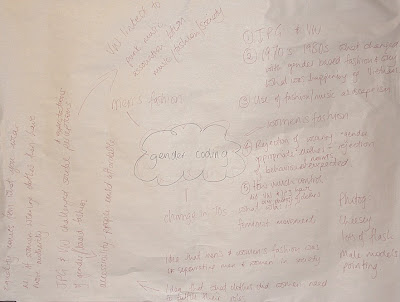
From the 1970s onwards, and particularly since the 1980s predominant fashion designers such as Jean Paul Gautier and Vivienne Westwood have explored the persistance of gender coding conventions and stereotypes through their designs. In most contexts nonconformity to gender roles through dress tends to signal lack of conformity in a broader sense.
Brainstorm:

The Key Ideas that we took from this quote were:
1. Jean Paul Gautier and Vivienne Westwood
2. What changed the notion of 'gender-based' fashion and why? What was happening in society - eg, Vietnam.
3. Use of music/fashion as escapism/rejection of societal norms.
4. Rejection of wearing 'gender-appropriate' clothes = rejection of behavioural norms.
5. How much control did Gautier and Westwood have over the photography/representation of their clothes.
Reflection on Lesson:
This was an interesting lesson! Although we literally just met the two fashion students (Sophie and Emma... i think!) we all worked really well together.
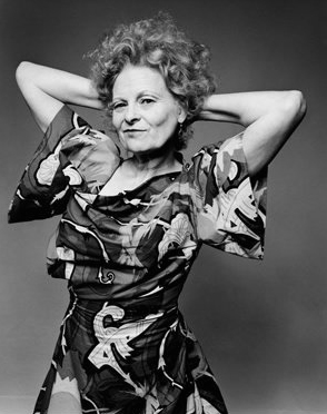
What was interesting was when the fashion students brought us a book on Vivienne Westwood showing us an photograph which was a self portrait of Vivienne. As photographers, the first thing we noticed was the hideous backdrop of 'clouds' not even noticing so much what she was wearing, whereas the fashion students told us they never would've even noticed that it was a backdrop in their life because they were so focused on the fashion! Perfect example of how we can help each other out with our differing areas of knowledge. Also shows you how our eyes are trained to see (perception), and what we, as students studying different subjects, tend to focus on or percieve first.
Gruen Transfer
One more thing, really enjoyed the Gruen Transfer! Tried to find Episode 1 Set 3 so I could add it as a link but I coudln't find that particular episode on you tube or the ABC website. Anyway I had never seen this show. Very informative and pokes fun at the effect of advertising. Relating it to fashion and our quote, yes, appearance and popular culture, epsecially TV advertising, have an enormous effect on societal norms and sub cultures. Both consumers and the media are interrelating determinants - media influences the society, the society influences the media.
Subscribe to:
Comments (Atom)